UI/UX, Systems Design
Visualizing actionable
insights for team leads
TL;DR
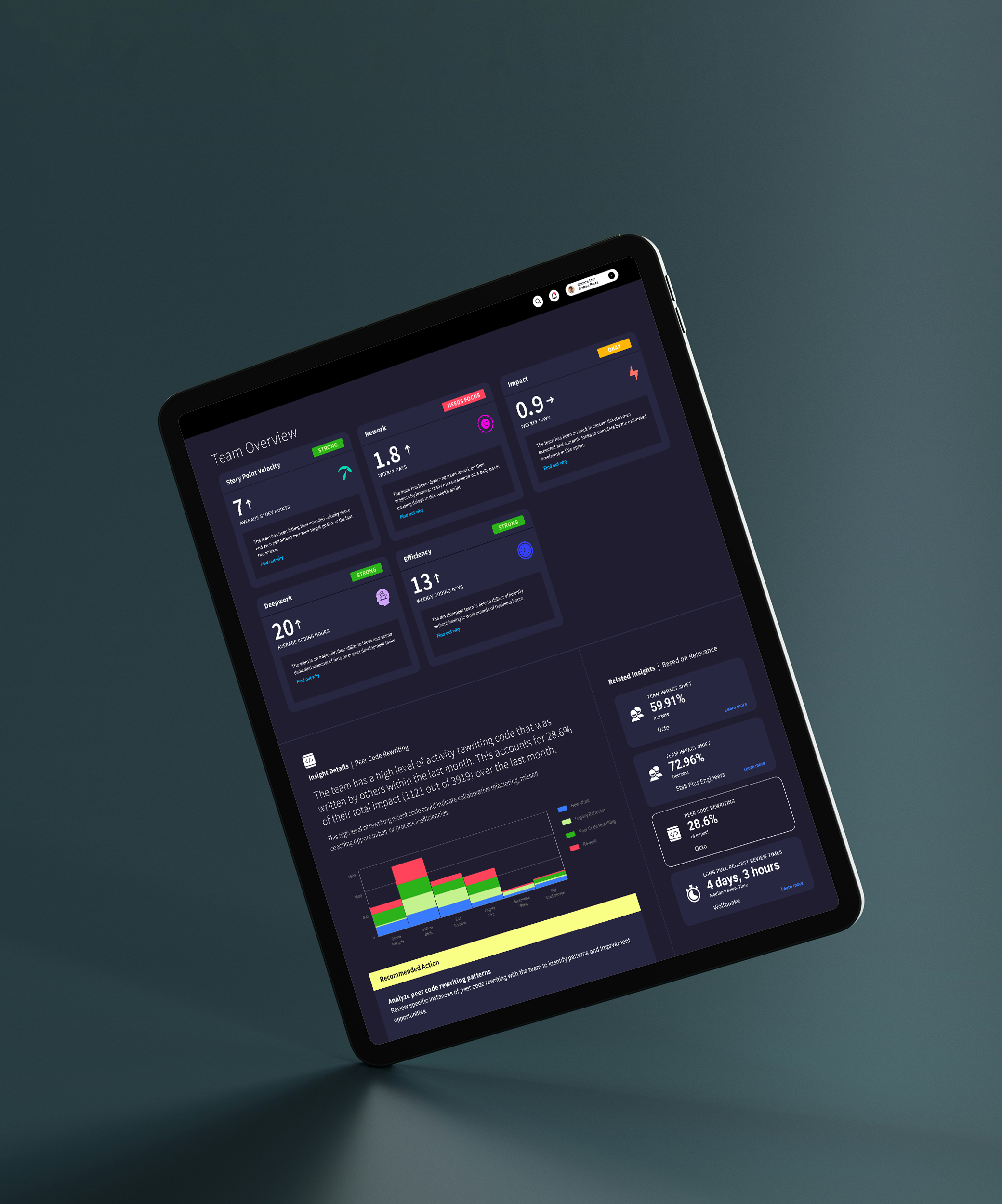
I created the user interface design for YearOne’s dashboard that provides actionable insights for Software Engineering teams
Context
Modern engineering teams often rely on superficial metrics that identify bottlenecks but fail to solve them. Like an athlete using performance wearables, YearOne leverages AI to turn complex data into actionable insights, steering organizations beyond reporting and toward data-driven success.
Approach
The UI is designed to guide users from identifying a bottleneck and digging deeper to understand the data. Took inspiration from performance-tracking apps to develop a UI that utilizes a streamlined, dashboard-driven layout that helps engineering teams visualize their "vital signs," making it easy to spot delivery risks and optimize output at a glance.